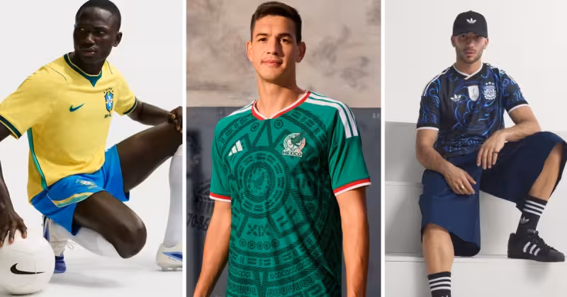
Mathew Davis held a print of the shirt up the way a dealer might hold a rare record and then, without hesitation, called it "the most elegant shirt of the tournament." Davis, who runs the vintage soccer jersey shop Saturdays Football, was speaking to a national broadcaster about the new World Cup kits and kept returning to Mexico’s design — a bold green Aztec pattern stamped with an imprint of the Piedra del Sol and a deliberate nod to the jersey Mexico wore in 1998.
He doubled down on the claim. "That’s a kit doing real cultural work, quietly," Davis said, meaning the shirt layers imagery and memory rather than only chasing a trendy visual. The Mexico World Cup jersey wears that work on its chest: a saturated green field patterned with stylized Aztec motifs and the circular echo of the Piedra del Sol, the sculpture that has long been shorthand for Mexico’s pre‑Columbian past. For collectors and supporters Davis treats as his audience, the shirt’s references make it more than a match‑day garment; they make it a statement.
Davis’s praise arrived amid a broader sweep of national designs that the broadcaster and Davis discussed. Brazil keeps the classic canary yellow but adds layered green accents on collar, cuffs and sides; the U.S. men’s team uses a curvy red and white pattern that resembles a waving flag; France embeds a subtle F zig‑zagged across alternating blue tones. Argentina’s shirt carries three gold stars above the crest to honor three World Cup victories, Colombia’s home shirt hides a butterfly motif in the weave, Portugal’s red kit shows wavy patterns evoking coastal life, and Senegal’s uses green, yellow and red in patterns meant to recall the car rapide minibuses common in the country.

Those comparisons matter because the conversation is not just about one jersey but about how a tournament’s visual language gets sorted and judged. The context is simple: this is part of a World Cup jersey roundup and the 2026 men’s World Cup will be larger than before — an expanded 48‑team tournament played over 37 days — which multiplies both the designs fans must parse and the marketplace for replicas.
The tension sits between Davis’s insistence on Mexico’s cultural specificity and the way design evaluations reduce shirts to rankable objects. A shirt that "does real cultural work" becomes an entry in a list alongside Brazil’s canary yellow and France’s zig‑zag F; the cultural labor embedded in the Mexico kit risks being read as a style choice in the same column as colorways and collar trims. Davis framed the Mexico shirt as an exception: one that references a 1998 heritage and an Aztec emblem at a time when many national kits read as visual shorthand rather than deliberate cultural statements.
One practical gap remains. Neither the broadcaster’s segment nor Davis’s interview identifies which brand produced the Mexico kit, and there’s no indication yet of when the shirt will first appear on the field. That absence matters to the fans Davis speaks for: collectors decide whether to preorder, retailers decide how much stock to buy, and supporters mark anniversaries and rituals by the day a team debuts a new shirt. Until the designer and the debut are clear, Davis’s verdict stands as the strongest claim in circulation — a vintage dealer calling a modern shirt the tournament’s most elegant — and it will shape how fans look at the mexico world cup jersey as soon as a maker and a date arrive.