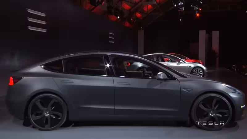
Ten years on from the March 31, 2016 unveiling, the Tesla Model 3 that customers received looks noticeably pared down from the car shown onstage. The prototype carried several high-contrast design and software elements that did not survive the move into production.
At the clearest level those differences are concrete: the prototypes used Model S–style self-presenting door handles that popped out as the driver approached; production cars use flush, manual pivot handles. Inside, the reveal cars leaned into an ultra-clean white aesthetic — white door panels, white interior door handles and a center console with a solid white trim plate hiding integrated cup-holder covers — treatments absent from production versions. The prototype steering wheel also lacked physical scroll wheels, and the software matched the bold hardware choices.
The prototype touchscreen layout devoted almost the entire display to navigation maps, with the speedometer overlaid directly on top of map elements and a vertical music player sitting on the far right edge. The UI used massive control icons that echoed the older Model S and Model X scheme and omitted the parked-car visualizations that now occupy the left side of the screen. By customer-delivery time Tesla had redesigned that layout: a dedicated left-side vehicle visualization was added, maps were shifted to the right and the speedometer was placed in a fixed location.
Those changes are not cosmetic footnotes; they reflect the program’s production priorities. Tesla intended the Model 3 as its most affordable vehicle for the mass market, and the prototype features were removed to simplify manufacturing and reduce production costs. The company was racing a ramp that Elon Musk famously described as "production hell" while pushing toward a target of 5,000 units per week by 2018, a pressure that forced trade-offs between distinctive design and repeatable assembly.
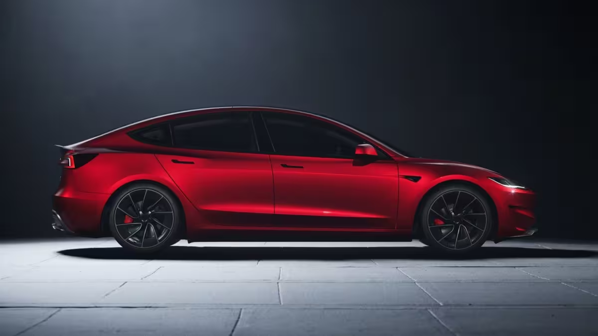
The consequence landed with buyers and the teams who had to put the cars together. Consumers did not get pop-out handles, the largely white interior shown at the reveal, or the prototype’s full-screen map-first interface. Engineers and production planners replaced mechanically complex or hard-to-source parts and bespoke finishes with simpler, easier-to-produce alternatives; the interface redesign likewise centralized key vehicle displays into fixed locations rather than the more experimental prototype layout.
There is a friction at the heart of the story: the reveal cars looked like design statements; the production cars became industrial objects. The prototype’s distinctive gestures and software choices pointed at a different human experience — fewer physical controls, larger graphical elements, a cleaner cabin palette — yet those same elements raised cost, complexity or both. Tesla removed or reworked them not because they were necessarily unpopular, but because they made the vehicle harder and more expensive to build at scale.
The shift also sits against a broader product posture: Tesla has recently ended Model S and Model X orders, and the Model 3 was always the company’s bid for volume. That context helps explain why the velocity of production and cost control often outweighed prototype ambition.
What remains unresolved is whether any of those excised prototype touches will return. The record shows Tesla will change hardware or software mid-cycle when it suits efficiency, cost or feature rollout plans, but there is no confirmation that self-presenting handles, the ultra-white package or the original map-first UI will be restored to the Model 3. A decade after the reveal, the prototype survives mostly as a reminder of the trade-offs required to turn a concept into a high-volume electric car — and the single more consequential question left open is which, if any, of its singular features might be reintroduced in future updates.