The Minnesota Timberwolves unveiled new uniforms, a new logo and a redesigned court on Sunday at Target Center as the franchise primes its visual identity for the 2026-27 season.
The rollout came in front of media and fans and arrives as the team heads into a new competitive chapter: the Timberwolves are coming off their fifth straight trip to the NBA Playoffs, earned the No. 6 seed in the West this year, reached the Western Conference Finals in two straight seasons and made this season’s semifinals before losing to the San Antonio Spurs.
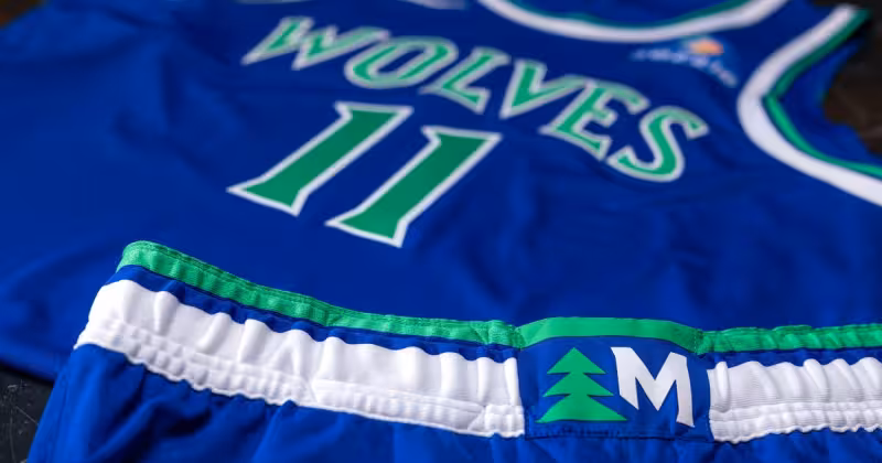
The team released an all‑new logo, uniforms and court designs that explicitly weave trees into the look and return to an evolved version of the franchise’s original blue, green and white palette. Officials described the package as a fresh identity rather than a simple retro reissue.
The new design direction grew out of years of fan feedback and leans on visual material that has long resonated with supporters: subtle references to the Old Shep era and an evolved take on the tree-lined uniforms that have been part of the franchise’s history for decades.
Timberwolves and Lynx CEO Matt Caldwell framed the unveiling around continuity and forward motion. "This franchise means something different to every generation of fans," he said, adding that the team wanted the new look to marry recognizable pieces with a feel true to the club and its culture today: "We wanted this new look to reflect the pieces of Timberwolves basketball fans have always connected with, while also feeling true to the team and culture surrounding this franchise today."
Caldwell went further on purpose and ambition: "More than anything, we wanted to create something that reflects where this organization is headed and what the entire state can rally behind." The organization highlighted those goals repeatedly during the presentation at Target Center.
Team officials emphasized that the visual refresh is meant to represent where Timberwolves basketball stands now and next, not to turn the clock back. That assertion sits beside an obvious borrow from the past: the new identity explicitly nods to Old Shep-era cues, tree motifs and the franchise’s original colors, creating a deliberate tension between heritage and future-facing intent.
Practical details are set: the uniforms and court will be used beginning with the 2026-27 season. The unveiling Sunday established the schedule for the visual transition and gave fans their first look at components of the package, but the organization stopped short of showing every element in full during the event.
The most visible pieces released so far—the logo, uniform templates and court motif—show the design language and color direction. What remains unresolved is the full, detailed execution: the complete set of uniform combinations, alternate and city editions, sideline apparel, and the day-to-day application of the logo across the arena and merchandising were not revealed in total.
That gap is the next moment to watch. The Timberwolves say the changes will appear on court and in team branding for 2026-27, and fans and retailers will be looking for the final rollout schedule and the full visual treatments that were teased Sunday but not exhaustively displayed.