


Sony Addresses PS5 UI’s Annoying Design Quirk with Update
Sony is trialing a small but practical change to the PS5 interface in its latest beta. Images from testers show the tweak affecting the console’s top menu bar.
What the beta reveals
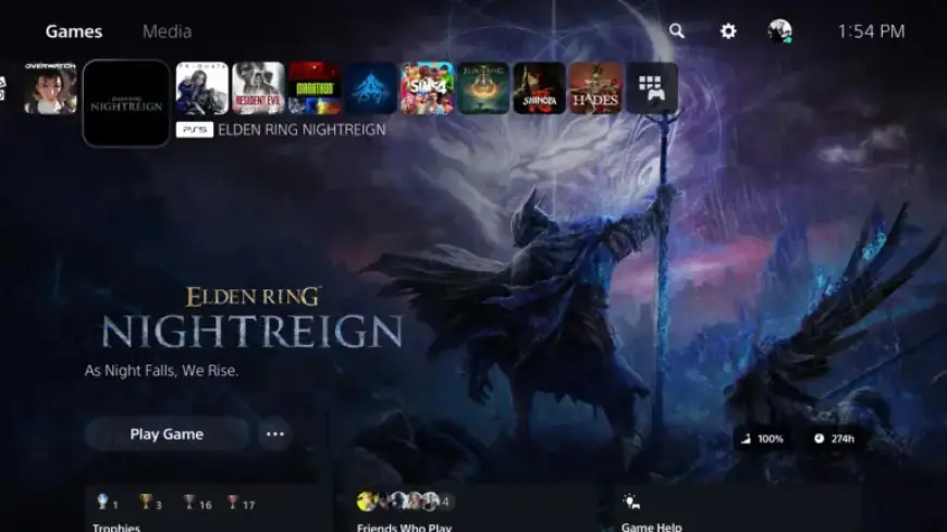
Currently, the PS5 UI divides the top bar into two main sections: Games and Media. Players move between them with L1 and R1 on the DualSense controller.
The Games area displays recently played titles, a Welcome hub, and icons for PlayStation Store, PlayStation Plus, and Game Library. The Media section hosts apps like Netflix, YouTube, Crunchyroll, Spotify, and Twitch.
The proposed adjustment
Beta screenshots indicate Sony plans to place the Store, PlayStation Plus, and Library icons above individual game icons. This reordering aims to let users reach the store or their library faster.
The change expands the usefulness of the L1/R1 navigation. It also reduces the number of steps needed to access key storefront and library features.
Context and history
Sony has not overhauled the main PS5 UI since the console launched in 2020. The company did add a customizable Welcome hub in 2024.
SIE described that 2024 addition as a widget-driven space to view information at a glance. The Welcome hub replaced the previous Explore tab.
Release timing and beta access
Sony has not provided a public timeline for wider rollout of this update. The tweak remains limited to participants in the company’s beta program.
Players interested in beta testing can register their interest on PlayStation’s official site. For more on this story, follow coverage from Filmogaz.com.
Why it matters
The adjustment addresses a long-standing PS5 UI annoyance by making key icons more accessible. Many owners will welcome a small fix that improves daily navigation.