


Did Fanatics just leak the new Tennessee Titans logo? Take a look
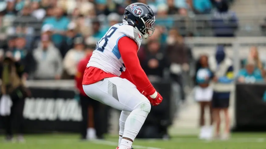
Speculation about a Tennessee Titans rebrand has heated up this offseason after a merchandise listing from a major online retailer surfaced with artwork that appears to show an updated team logo. The design echoes familiar elements while stripping back some of the current logo’s embellishments, prompting fans and analysts to debate whether this is the first clear glimpse of a 2026 overhaul.
What the leaked artwork appears to show
The image on the retailer’s listing presents a simplified mark that keeps the familiar shield-and-sword silhouette but removes the flame-like accents that have been part of the current identity. Color-wise, the mark shifts to a brighter, cleaner "Titans Blue" instead of the darker navy tones used in recent years. The overall look feels more streamlined and retro-inspired, with a focus on bold shapes and a pared-down color palette.
How this compares with the current logo
The existing mark is recognizable for its dynamic, modern details—the swooping flames and darker blue tones among them. The artwork from the listing trades those dynamic flourishes for a flatter, more heritage-driven aesthetic. If genuine, the update would represent a move toward visual clarity that reads well on apparel and digital platforms, while nodding more directly to the franchise’s historical color story.
Why fans are reacting
Design conversations exploded once the listing went live. Some supporters praised the cleaner look and the return to a brighter blue, saying it would work better on jerseys and merchandise. Others pushed back, arguing the current logo’s energy and modern touches are part of what makes the team’s brand distinct. The mix of mock-ups, meme-driven commentary and earnest design critiques has kept the topic trending among the fanbase.
How this aligns with prior hints from the organization
Hints from team leadership over the past year suggested any future overhaul would embrace the franchise’s history and color scheme more directly than past iterations. Those comments framed expectations for a redesign that feels familiar rather than radically different. The leaked artwork, with its color shift and simplified motif, would fit neatly within that stated direction.
What comes next and the possible timeline
A full identity or uniform rollout typically follows a controlled schedule: internal approvals, trademark filings, product production and a coordinated public reveal. Industry chatter places a potential uniform and brand refresh window in 2026, which would give the organization time to align licensing and merchandising plans. If the listing was premature, the retailer may pull the products while the team finalizes its rollout timeline. If the reveal is intentional, expect an official announcement, coordinated apparel drops and expanded retail availability to follow.
Merchandising and legal implications
Retail listings that surface before an official reveal can complicate licensing and production plans. Premature images may require urgent takedowns or surgical edits to prevent spoilage of a carefully orchestrated launch. From a fan perspective, early leaks can boost excitement but also raise questions about quality control and whether a leaked image represents the final mark or a placeholder variation.
For now, the image on the retailer’s site offers the strongest visual hint fans have seen in months. Whether it proves to be the final word on a refreshed identity or a premature mock-up, the discussion it has sparked shows how deeply brand aesthetics matter to a passionate fanbase. Sound off: do you like the cleaner, brighter look, or would you prefer a bolder redesign?