


Discover Why Nothing Crafts Phones as Iconic Logos
In an industry where smartphones often blend into one another, Nothing aims to stand out by redefining phone design. The company has created a unique identity with its devices, notably the Nothing Phone (4a) and its Pro counterpart. Both models feature a transparent back that reveals the internal mechanics, creating a visually striking effect unlike typical smartphones.
Redefining Design: The Nothing Approach
Nothing’s design philosophy is rooted in creating recognizable hardware. Adam Bates, the Global Design Director, emphasizes that their goal is for devices to resemble graphic art. Each phone is treated like a logo, emphasizing visual recognition. This approach has successfully differentiated Nothing from competitors who often opt for subtle design tweaks.
Innovative Transparency and Colour
- Nothings’ transparent designs echo the aesthetics of retro technology.
- The latest range, including the blue metallic edition of the Nothing Phone (4a), integrates vibrant colours into the transparent structure.
- This strategy provides depth and complexity, challenging common industry colour palettes.
Lucy Birley, responsible for Colour and Material Design & Strategy, articulates that the team draws inspiration from various art forms and historical references. This eclectic mix informs their design process, linking past aesthetics to contemporary gadgets.
The Influences Behind the Design
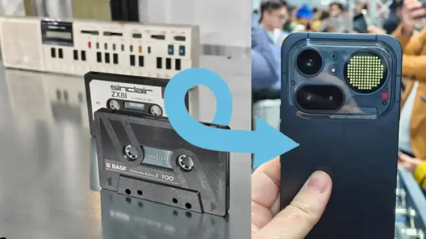
Nothing’s inspiration can be traced back to vintage technology. Items like old Game Boys, cassettes, and cameras populate the design studio. This retro influence is evident in how the team blends historical styles with modern technology. The idea is to imagine an alternative technological evolution, one where creativity remains at the forefront of design.
Breaking Away from Convention
Modern smartphone designs frequently follow a conservative template. The same glass rectangle shape dominates the market, often leading to a lack of innovation. Bates believes this results from past hits leading to imitative designs. Nothing counters this trend by refreshing its perspective for every new project.
Creativity Through Collaboration
Nothing fosters a collaborative environment where team members contribute diverse influences. This cross-pollination of ideas often leads to novel designs. Lucy mentions that their influences go beyond just tech, pulling from art, culture, and even everyday experiences.
Challenges and Observations on Colour
In an era when smartphone aesthetics are often dull, Nothing consciously adds colour to its products. The company’s research has revealed a once-vibrant history of tech design, rich with bold colours. This commitment to a colourful palette aims to revive a sense of optimism and creativity in consumer technology.
Disrupting the Norm
Ultimately, Nothing seeks to disrupt the conventional tech market. The brand’s strategy focuses on creating visually distinct products that resonate with consumers. Bates asserts that the identity of their devices should be bold and memorable, breaking away from the typical sameness that defines most smartphones.
In summary, Nothing is crafting an iconic identity in a crowded market. By embracing transparent designs, vibrant colours, and creative inspirations, they continue to challenge industry norms. As the brand grows, its commitment to innovation remains evident in every new release.