


Google Phone App Introduces New Material 3 Expressive Bottom Bar
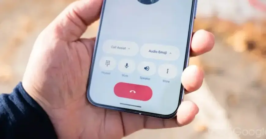
Google Phone has undergone a significant update, fully embracing Material 3 Expressive design principles. This update comes with a crucial change to the app’s bottom navigation bar, which has now been shortened.
Update Details on Material 3 Expressive Bottom Bar
Previously, Google Phone maintained a taller bottom bar that included tabs for Home, Keypad, and Voicemail. With the rollout of stable version 204 last week, the app now features a more compact navigation component.
Changes Observed
- The padding above the pill-shaped tab indicator has been significantly reduced.
- Text labels beneath the tabs have been tweaked for improved clarity.
These enhancements are particularly noticeable when utilizing the dark theme. While the actual space savings may be minimal, this update contributes to a more coherent user experience. Last month, Google Home also received a similar update, indicating a shift towards a streamlined design across Google’s apps.
Ongoing Features and Exceptions
Despite these changes, some features remain unchanged. The “Keep portrait mode” setting has not yet been reintroduced for users. Additionally, the Expressive Calling feature is still in beta testing.
Apps Yet to Update
While Google Phone has embraced these design changes, other applications such as Google Photos, Google Fi, and Google Voice have not yet received the same attention. This ongoing update strategy suggests a deliberate effort by Google to modernize its user interfaces gradually.
In conclusion, the shift to a shorter bottom bar in Google Phone marks an important step in aligning the app with Material 3 Expressive design standards. Users are encouraged to update their app to experience these new features and improvements.