


Google Compares Gemini’s Gradient Design to 1984’s Iconic Smiling Mac
This week, Google Design unveiled new insights on the Gemini app’s innovative gradient design. Google draws a fascinating parallel between Gemini’s visual strategy and the iconic Macintosh user interface from 1984, famously characterized by designer Susan Kare’s joyful illustrations.
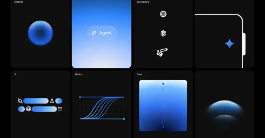
Gradient Design: Bridging User Experience and AI
The introduction of AI assistants has been deemed an “uncharted design territory,” much like the early days of personal computing. Kare transformed abstract digital processes into tangible experiences. Her famous icons, including a trash can and a smiling computer face, helped users interact with technology intuitively.
In a similar vein, Google emphasizes the importance of gradients in enhancing user engagement with Gemini. These visual elements aim to guide users through a comprehensive collaborative environment. Gradients serve as directional cues, nudging attention toward critical information.
Functionality of Gradients in Gemini
Gradients accomplish several key objectives:
- Energy Conveyance: They symbolize energy and motion rather than objectivity.
- Visual Guidance: Sharp, translucent edges of gradients direct users to the most significant elements.
- Life-Like Representation: Gradients help portray Gemini as an active and thinking assistant.
Notable features of Gemini that utilize gradient design include the Gemini Live overlay on Android and unique activation animations. The design team’s exploration of various animations enhances user interaction, such as shrinking displays or swiping gestures.
The Role of Motion and Shapes
Besides gradients, motion plays a pivotal role in Gemini’s interface. Each animation is crafted to demonstrate a clear start and finish, mimicking the user’s actions. This creates a seamless flow, making the AI’s capabilities more accessible.
Furthermore, the deliberate use of circular shapes signifies comfort and simplicity in design. Even Gemini’s logo is constructed around four interconnected circles, emphasizing harmony within the interface.
Approachable and Trustworthy Design
Google intends to make Gemini not only intuitive but also welcoming. The gradients provide a soft approach, encouraging users to interact without hesitation. This quality is achieved through:
- Clear Language: Simple terminology supports user understanding.
- Transparent Signaling: Visual indications make the system’s function clear.
Ultimately, Google aims for Gemini to embody aspirations of trust and immersion. The evolving gradient design is integral in creating a reliable and engaging user experience.